HMBradley Design System
It's really not that complicated
I started the HMBradley Design System in our early growth stage to keep my designs consistent while maintaining velocity. I intended the design system to be an all-encompassing component library that would cover every use case, but due to the nature of startups with constant product changes and whatnot, the philosophy shifted to producing high quality components that satisfied the most common use cases.
First things first
Beyond fixing the hassle of having to manually type in the correct hex codes and text sizes every single time, having a defined type ramp and colour palette meant everyone was on the same page for when to use what style.
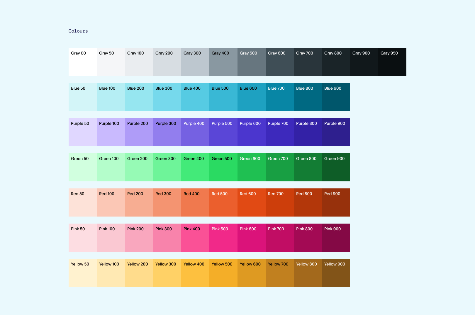 Expanded colours selected by J Scott Smith.
Again, it's really not complicated
When I started this design system initiative, I made the bone-headed move of trying to figure out every possible component we could ever need. What ended up happening was that we'd use a few components extremely frequently, and the ones that were too bespoke were always detached so that modifications could be made.
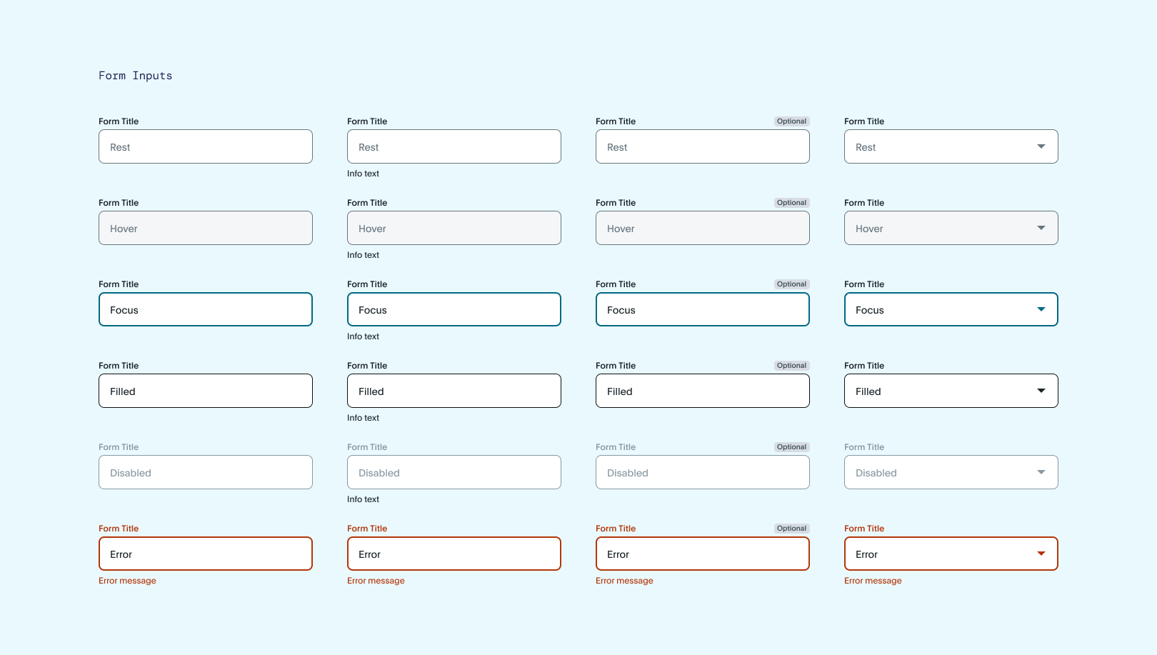
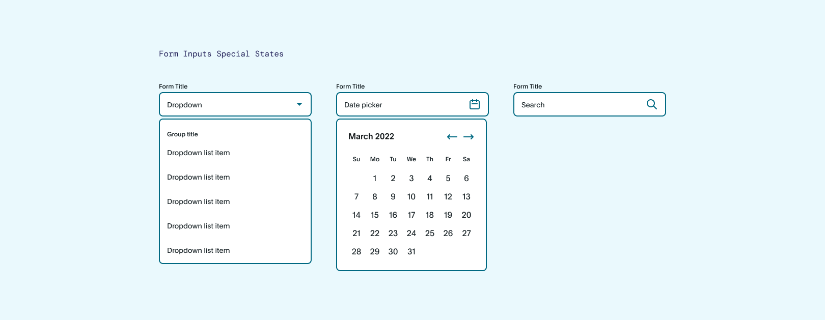
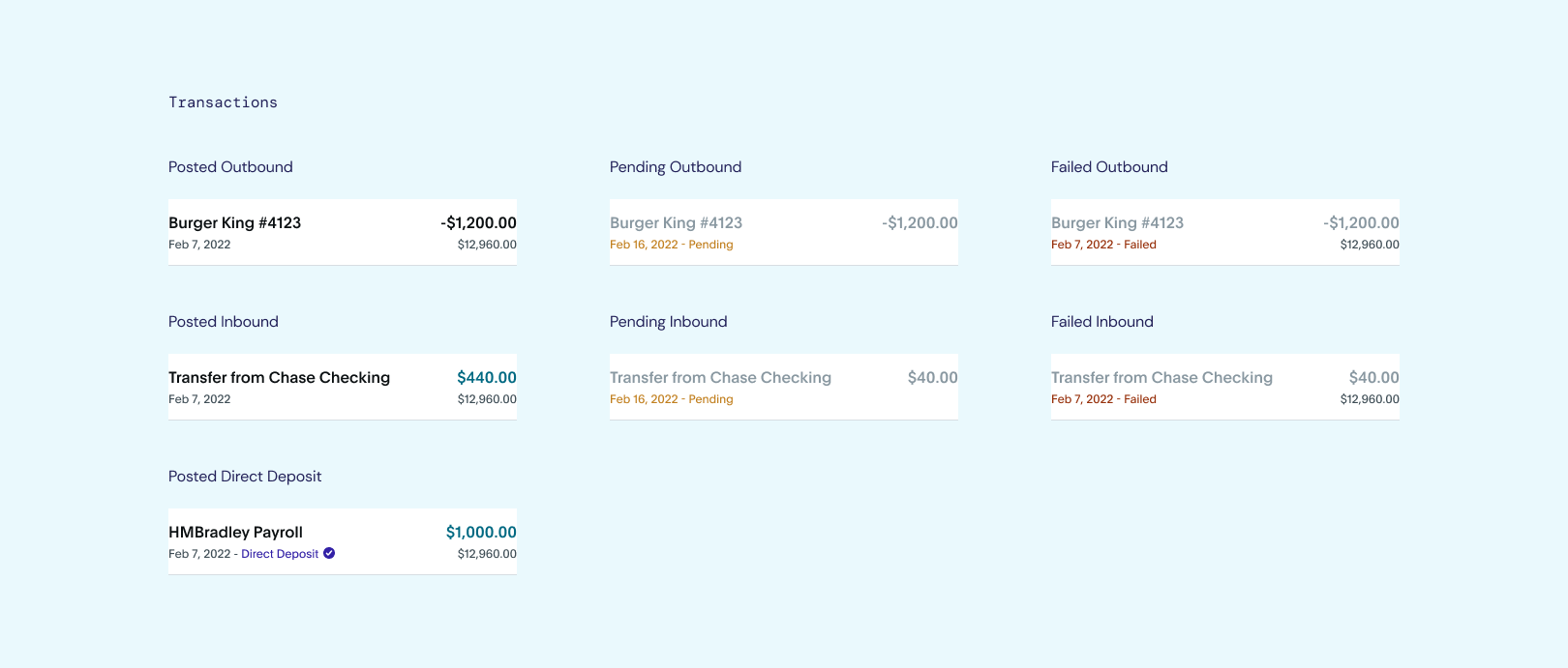
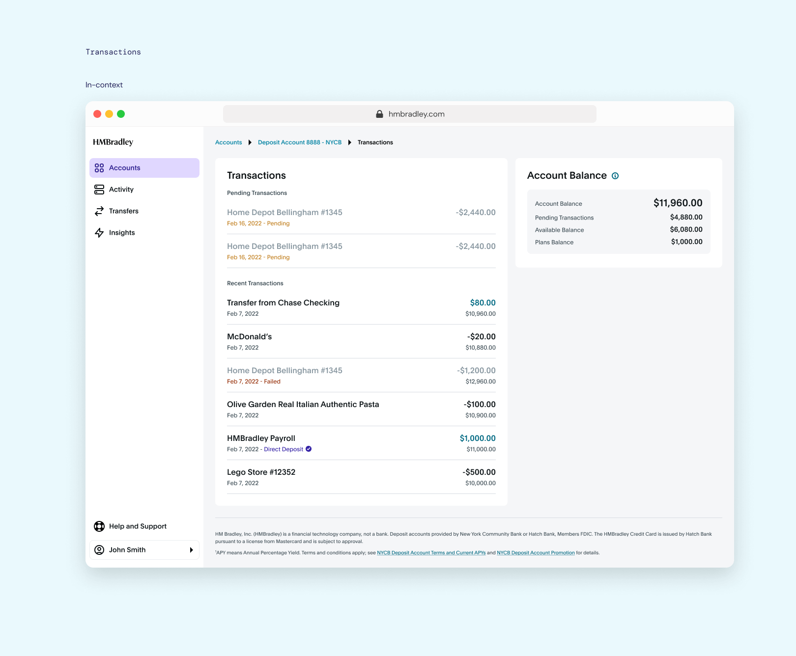
The components that don't change too much and provide the bulk of user interactions were the ones I focused on. Before my untimely departure, I was on my way to to accomplishing this. Unfortunately, only form inputs and transactions were completed, with proper documentation.
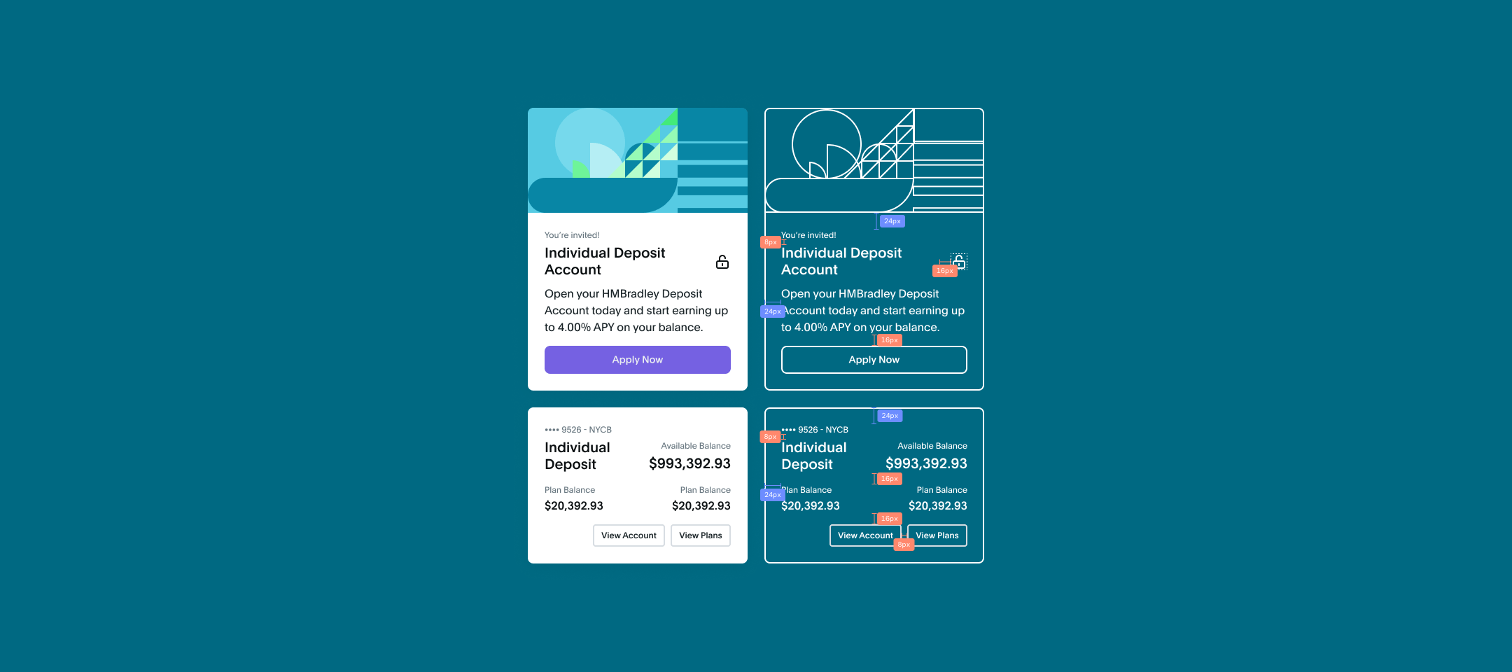
 Credit account cards and illustration made in collaboration
with Michele Shi and Shan Wei.
Credit account cards and illustration made in collaboration
with Michele Shi and Shan Wei.
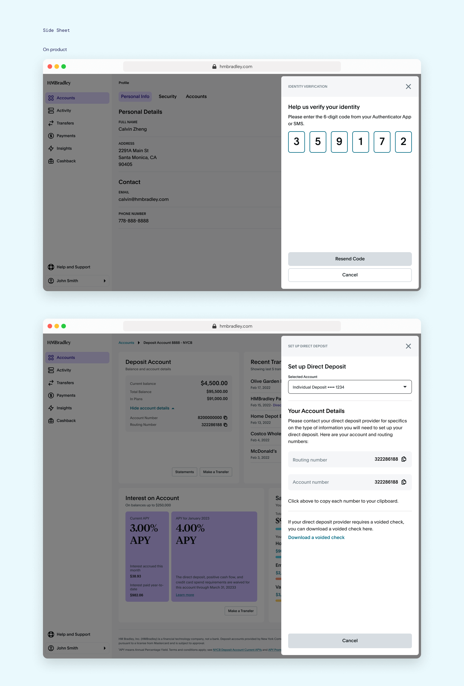
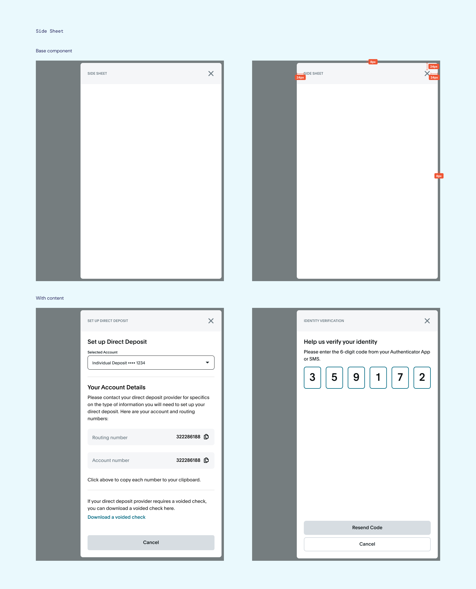 Direct Deposit side sheet by Shan Wei.