HMBradley Deposit Account
From 0, to 1, then to 2
The HMBradley Deposit Account is HMBradley's first and core product. It was important as a fintech banking platform to allow our users to, well, bank. I led the design, and subsequent redesigns of the deposit account as we grew, transitioned bank partners, and built out our core to accommodate more features.
Launching with core features
For launch, the two most important priorities were to highlight our core offering, Savings Tiers, and to allow users to do their banking.
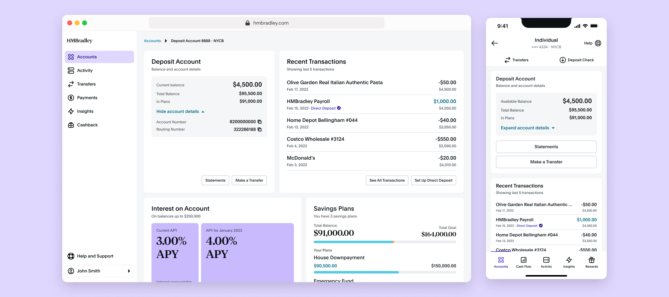
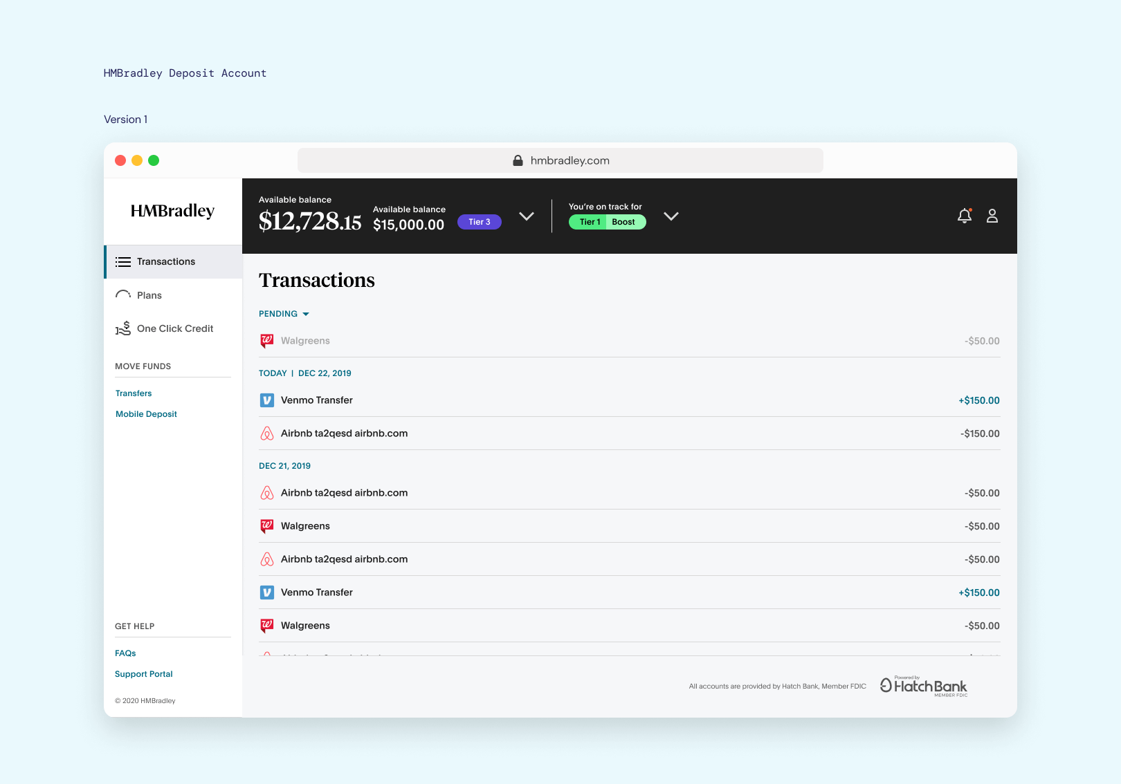
Basic deposit account
The first live version of the deposit account was very simple, with transactions front and center. No frills, but all basic banking tasks could be done, such as transfers, checking transaction details, and mobile check deposit (for mobile devices).
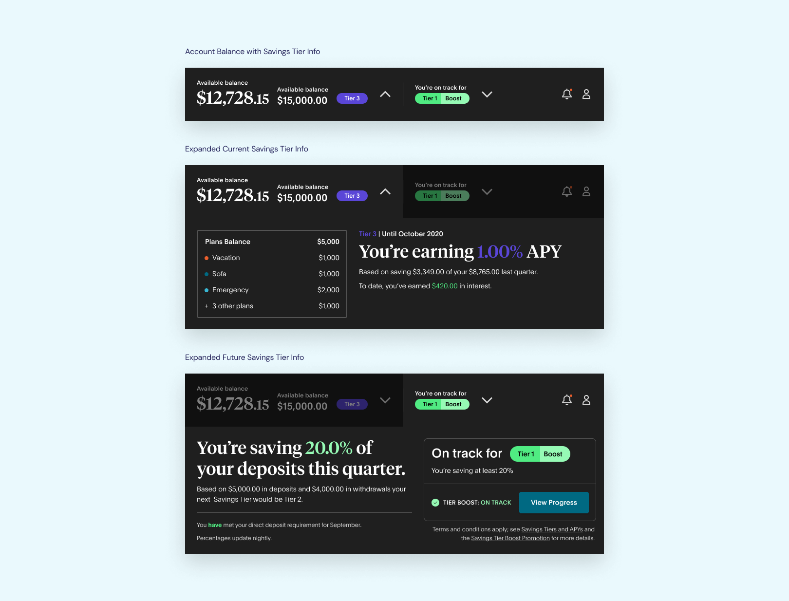
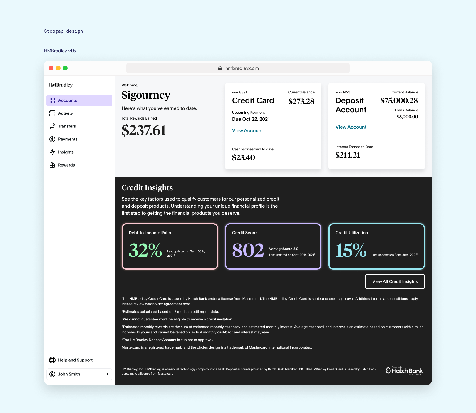
Savings Tiers
Savings Tiers was our way to reward users for good financial habits. Behaviour in the current quarter would affect next quarter's Savings Tier, so it was imperative that this was spelled out in big letters on the UI.
Expanding the UI
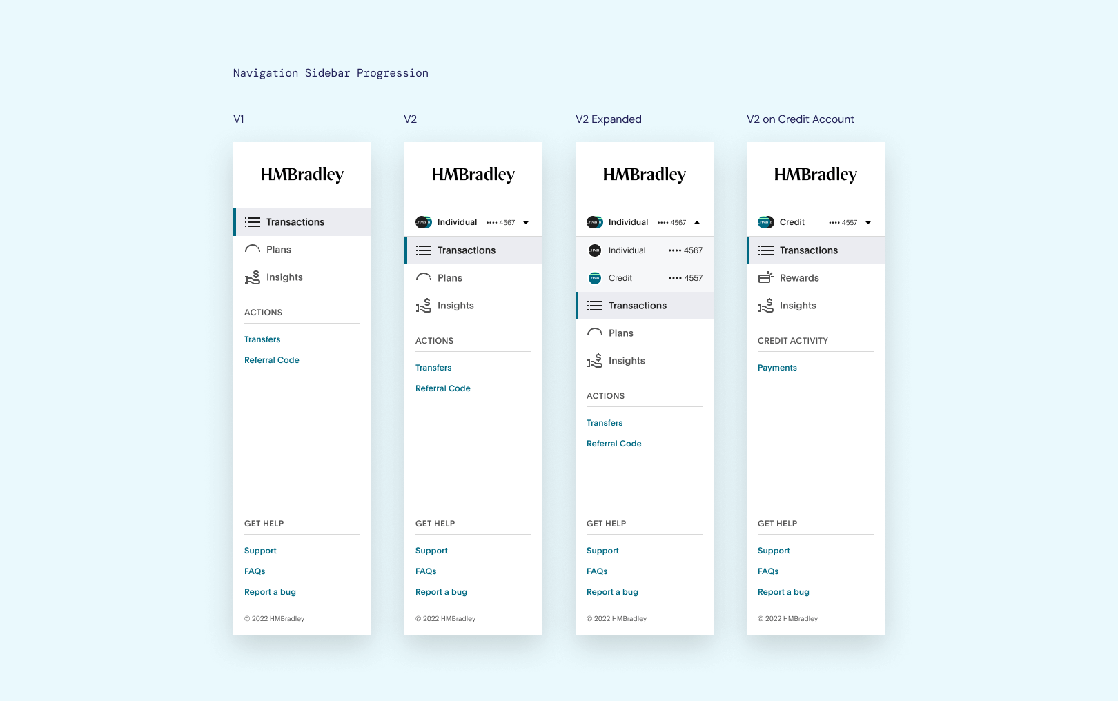
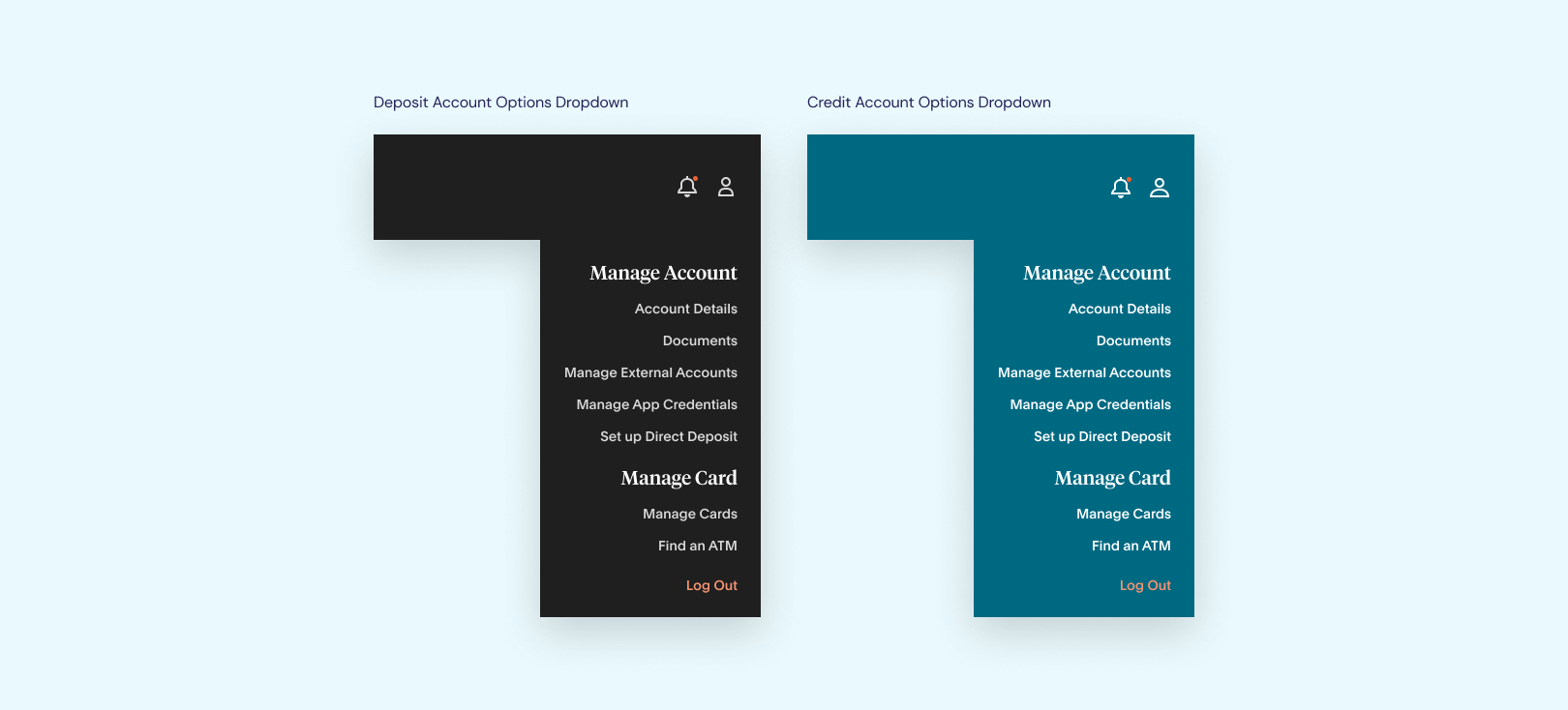
After some time, we introduced our second product, the HMBradley Credit Card. This meant the navigation had to be tweaked to accommodate multiple accounts. A new account header also had to be designed for Credit Card accounts.

Mo' features, mo' problems
This design introduced some problems. Every page in the app now had a contextual component on it in the form of a navigation bar and header set to an account. For account-neutral actions, such as checking account settings, having this added context only served to confuse users and complicate things for engineering.
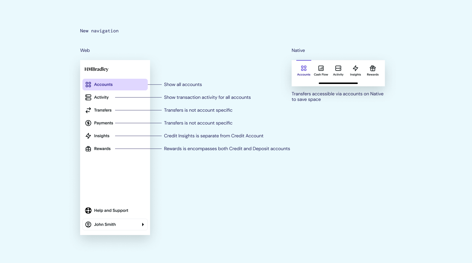
HMBradley 2.0
I designed and user-tested a new home page, with the focus on figuring out if a dashboard view as an entry point made more sense. Instead of forcing users to see the deposit account every time they logged in, they could now see every account, and pick their own path.
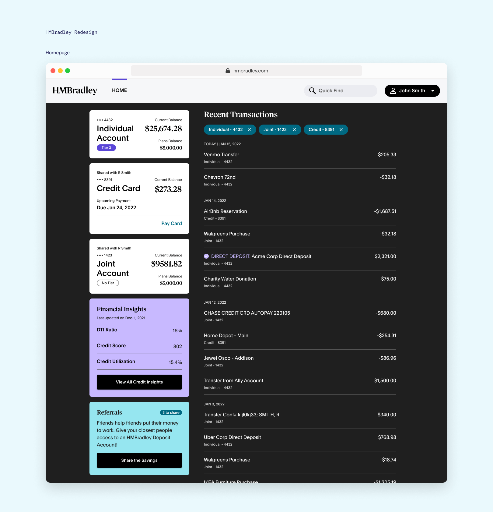
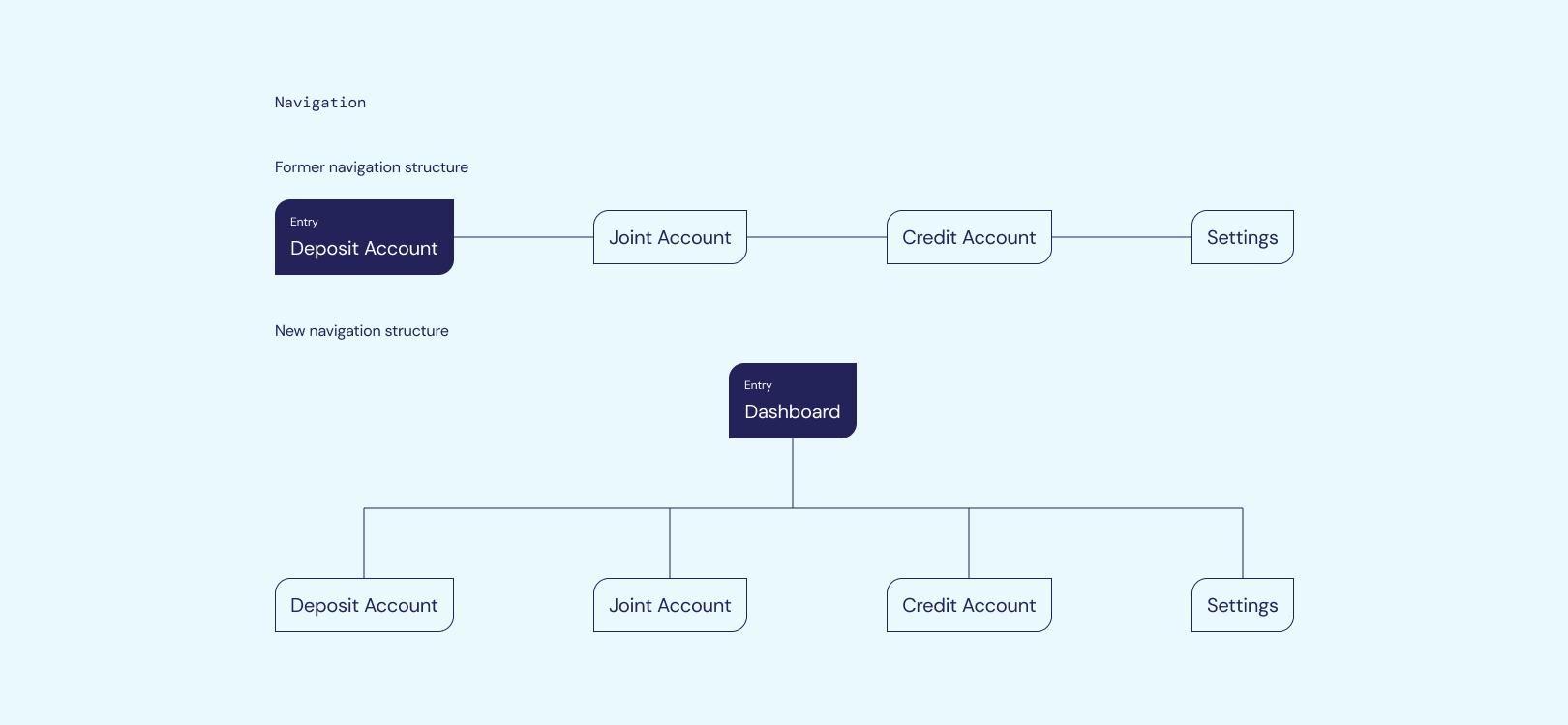
Creating a higher-level view
The old navigation structure was very parallel, and the entry point being the deposit account was just because that was the first product we ever launched.
User tests showed that having an entry point that showed every path, and allowing users to choose, made it easier for them to find what they needed. It was also easier to build and maintain.
Rolling with the punches
There was a period of weird in-between-ness due to us transitioning bank partners. While the engineers were working on the migration in the backend, we slowly rolled out new design elements for HMBradley 2.0 on the frontend.
Purposely ugly design
The transition to our new bank partner was not without its fair share of work. Mostly, it was a balancing act of writing just enough legalese to stay compliant, but not too much that we would require our users to buy bigger monitors.
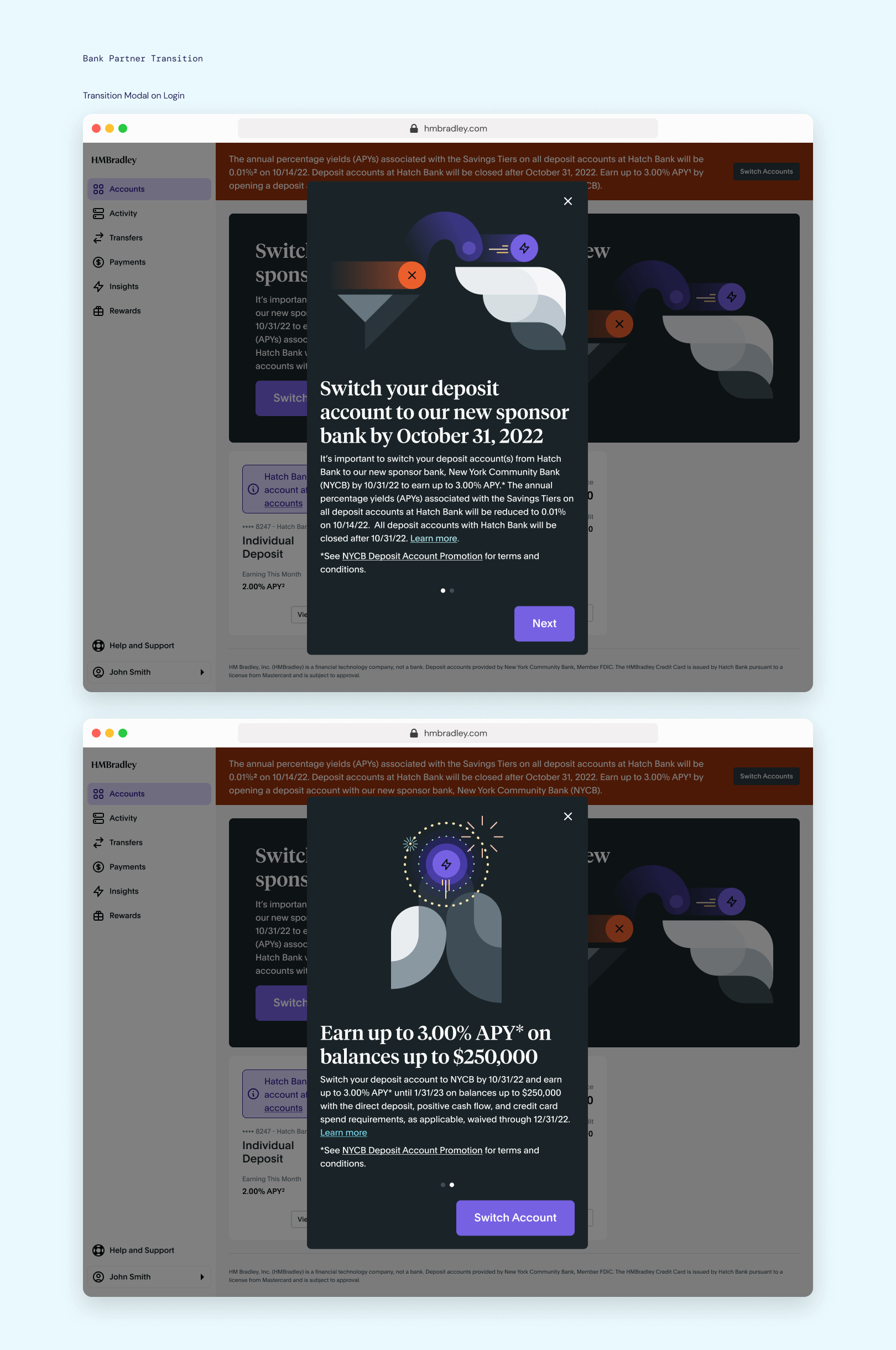
The worst homepage I could design
The intention behind this page was to be annoying. We couldn't automatically transfer user accounts to the new partner bank, meaning they had to opt-in voluntarily. I made not opting-in look as painful as possible, to motivate them to transition their accounts to our new partner bank.
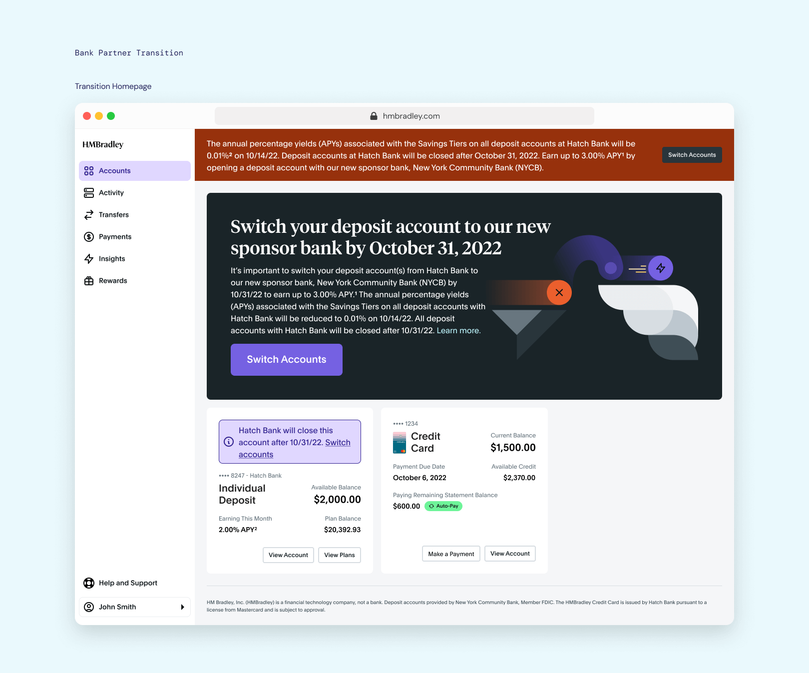
The timeline thus far
A great deal of time was sent in the last year rebuilding our core from the ground up, to enable the possibility of building the actual cool features we dreamed about since day one. As a result, there's a ton of features in the pipeline, and what's currently live serves as a shell.
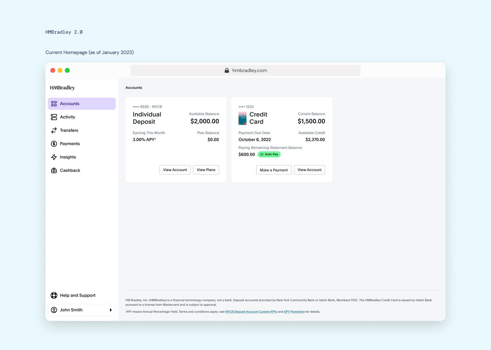
What's currently live
So the current homepage/dashboard looks something like this. Somewhat empty (and even emptier if you don't have a credit card account), but it's to serve as a foundation for actual dashboard-y things to come.
What's to come
This is the next iteration planned for the homepage, where useful insights are presented to users, so that they can make better financial decisions.
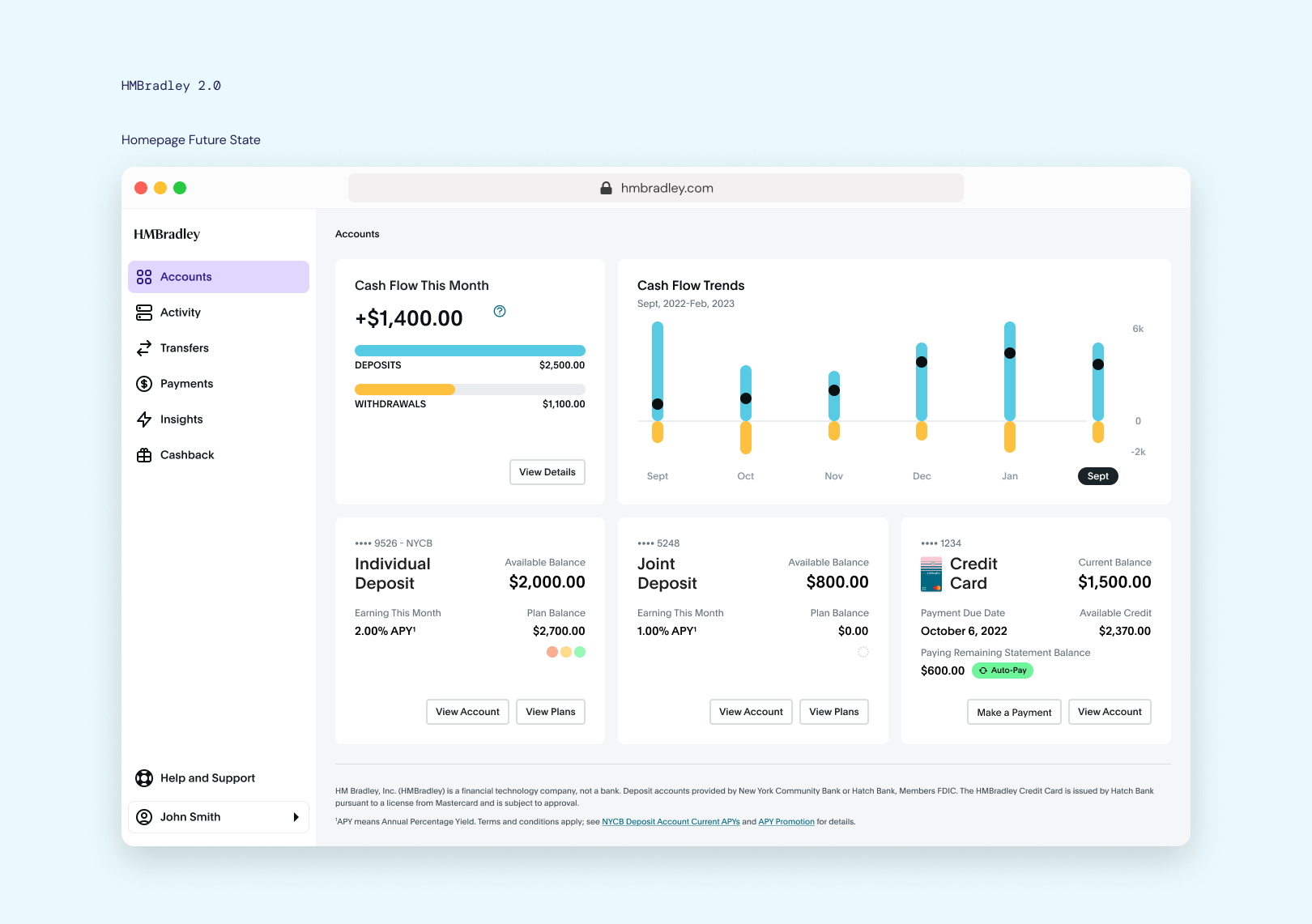 Cash Flow modules designed in collaboration with Shan Wei
and Michael Fox.
Cash Flow modules designed in collaboration with Shan Wei
and Michael Fox.
The thing in the title
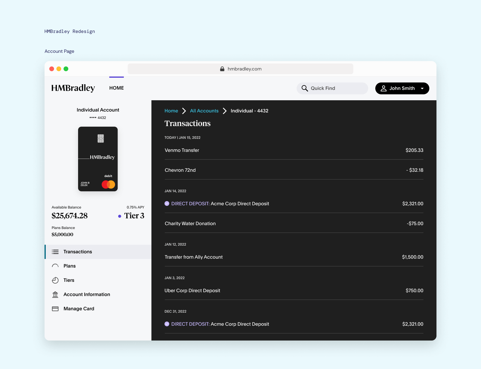
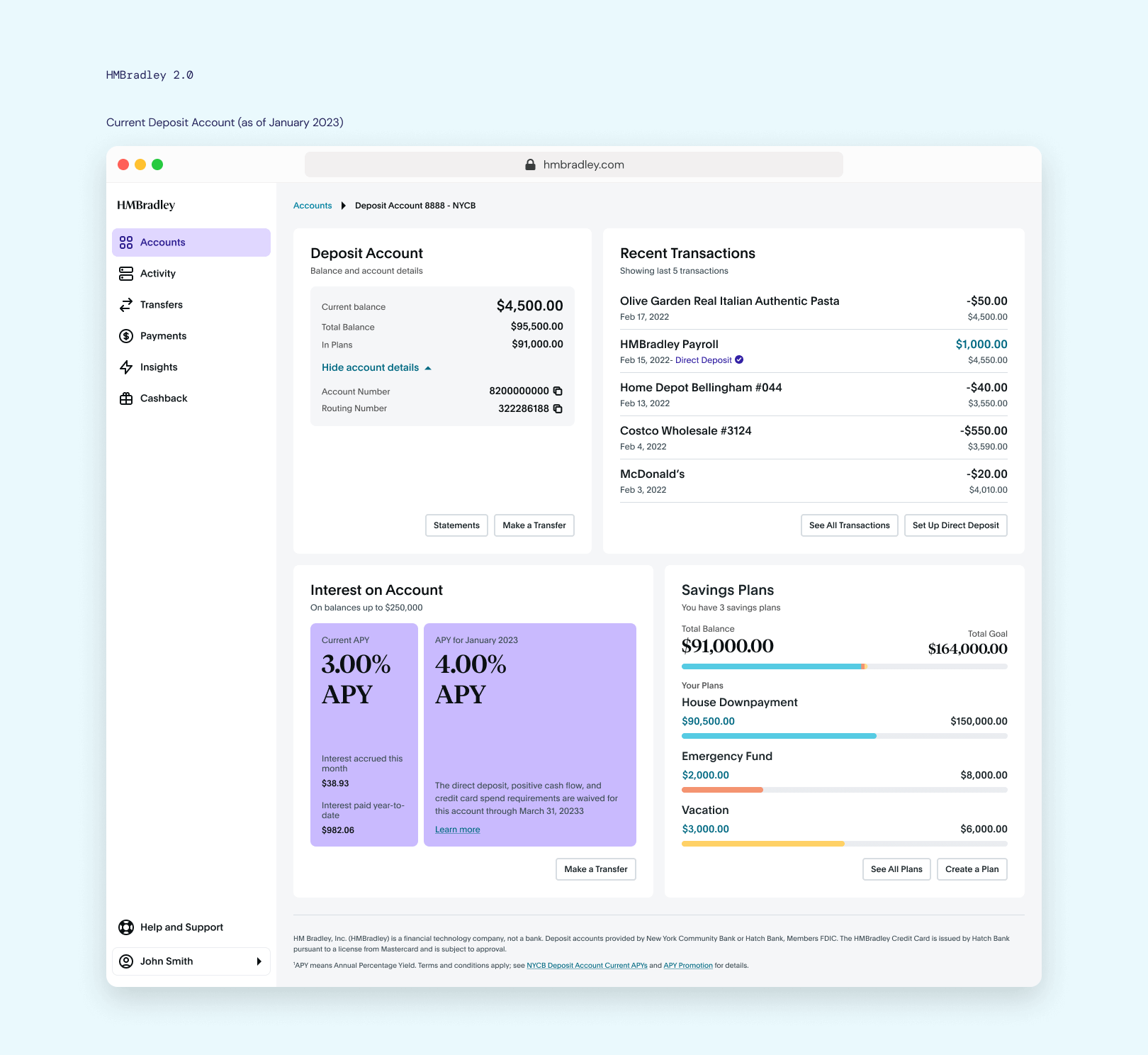
And of course, the actual deposit account itself, is in a way, its own dashboard. We've come a long way from just being a page of transactions...
4 years later, what did I learn?
Having seen HMBradley grow from a whiteboard idea into what it is now, I can say that if I had the chance to do it all over again, I would. But I'd like to do it all over again with the knowledge I have now.
Balance new and table-stakes features
Early on, the focus was on ensuring we had all the table-stakes features up and running. While important, I think that for a startup in its early stages of growth, it would have pushed the product further if I had put more focus on what made us different in the market of fintechs. While we had incredible customer stickiness due to the nature of our rewards structure, the reality is we couldn't outspend traditional banks with deep pockets, so if I had to do it again, I'd prioritize designing features that actually help our customers build good financial habits, which would probably increase engagement at a lesser cost.
Realize sooner that done is better than perfect
I wanted so bad for everything to be pixel-perfect, and should have realized that when a product is growing this fast, there is no possible way for everything to be perfect. There were definitely things I could have done, such as establish a relationship with engineering earlier on in my tenure to deal with things like design component inconsistencies, but ultimately, I should have told myself to accept that getting the most impact out of the least amount of work is the real goal. We would have been able to move much faster.