Microsoft 365 "What's New"
Show me what's new
This is my intern project from the summer of 2019, where I was a Motion Design Intern on the Microsoft 365 Design Direction team. The existing experience for showing users new updates to the M365 ecosystem felt disjointed, uncool, and needed some TLC.
Educating should not be annoying
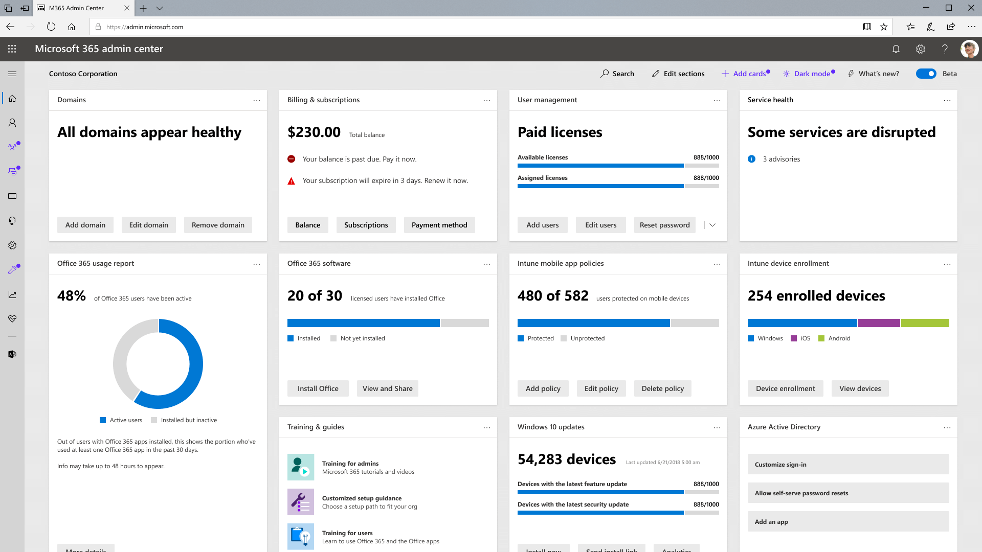
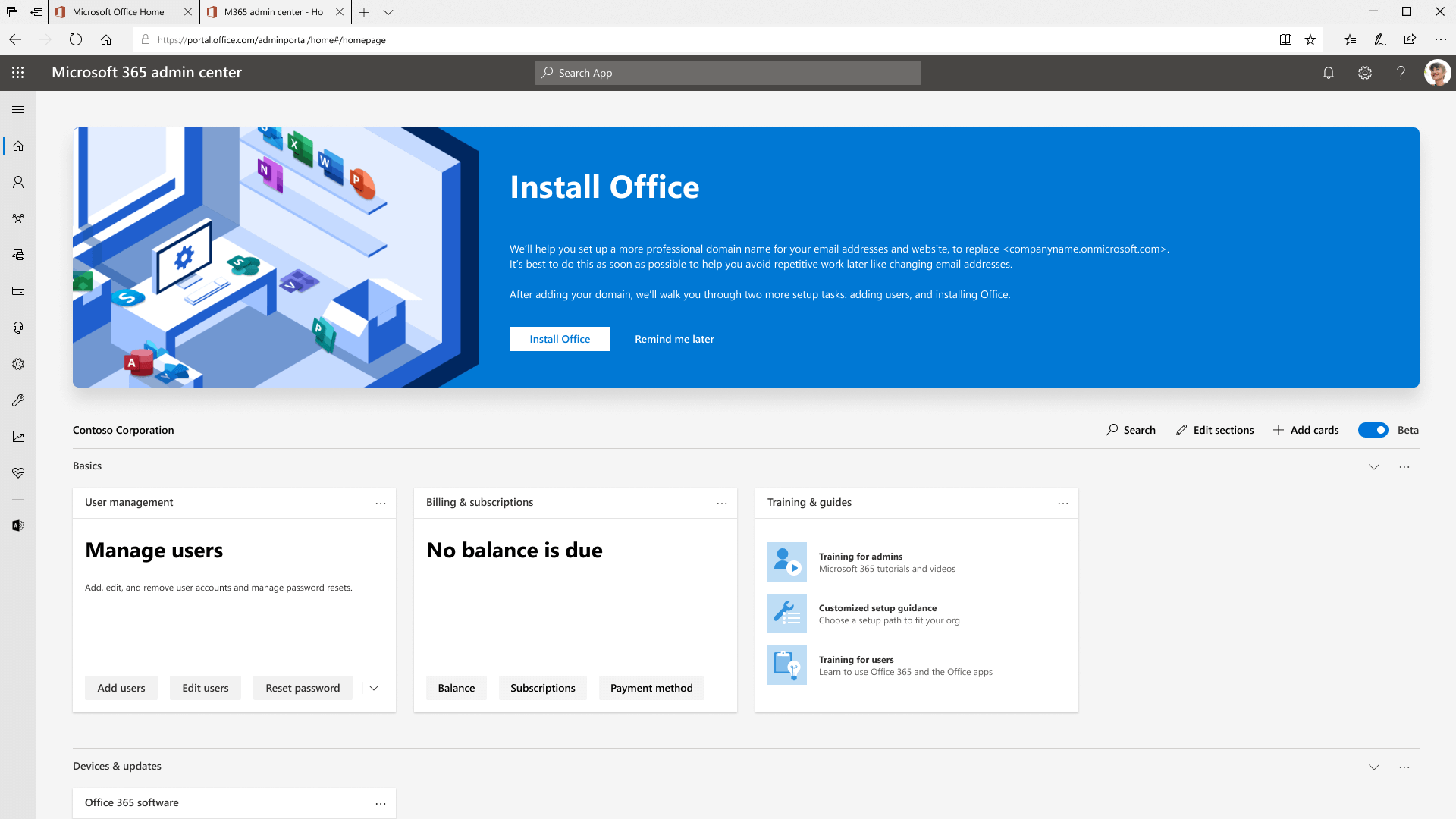
There was this link that took users to a page explaining what was new. Patch notes. I like reading patch notes, for things like video games, but when you're an IT admin with things to do, a link that takes you out of your dashboard experience is extremely annoying.
Gathering initial insights
There were no real constraints for this project. I was presented with a blank canvas. I'm not very good at coming up with brand new ideas completely on my own, so I asked my PM, "what are some "must-knows" for the user?". Each of these "must-knows" was followed up with a quick UI mockup, intended to solicit feedback from more knowledgeable stakeholders.
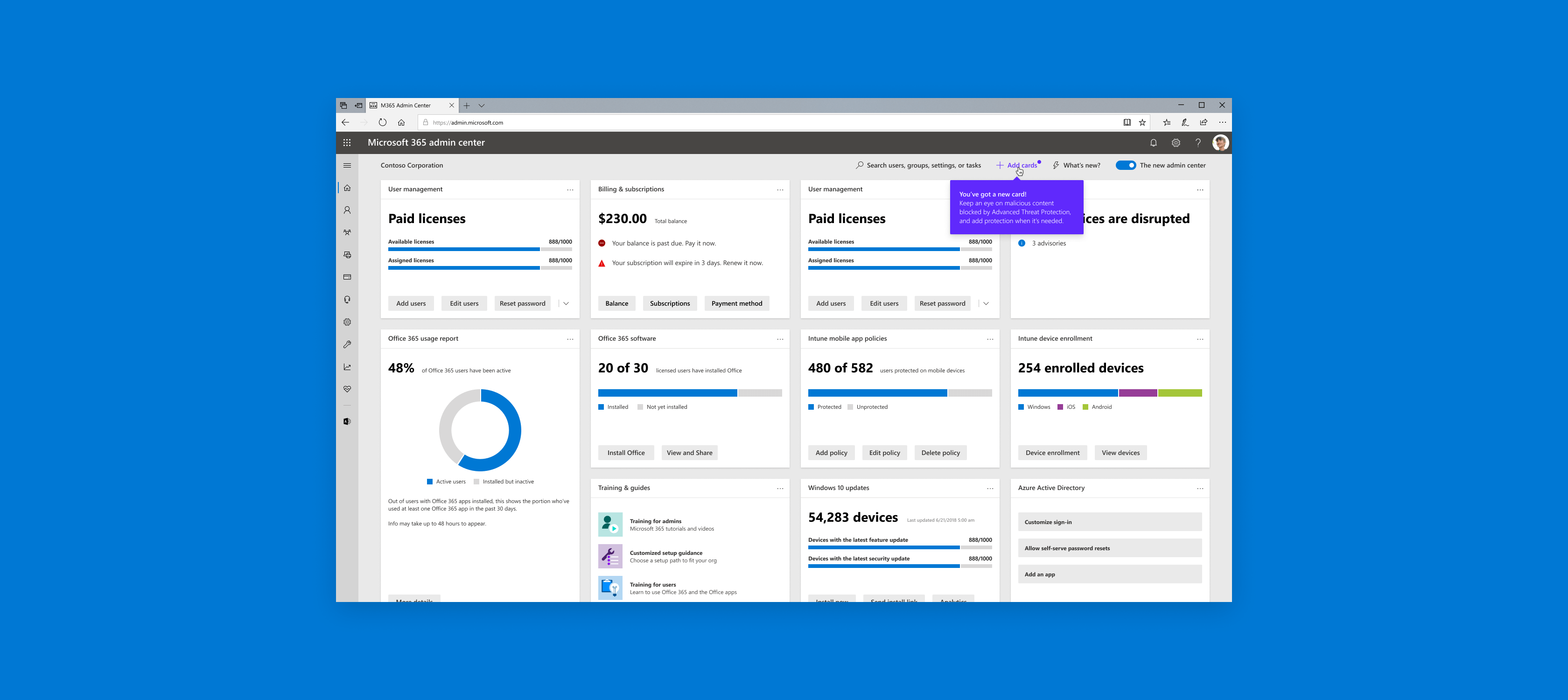
New things on a dashboard
When new features are released, they're highlighted for the user to see. The user can dismiss or keep the card.
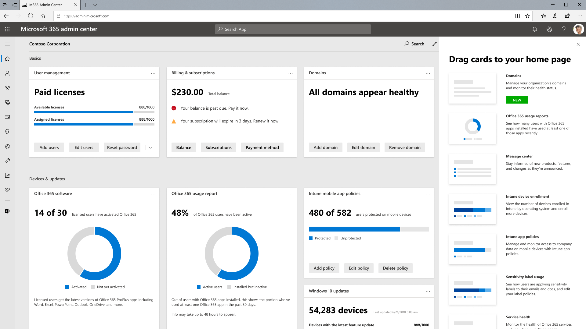
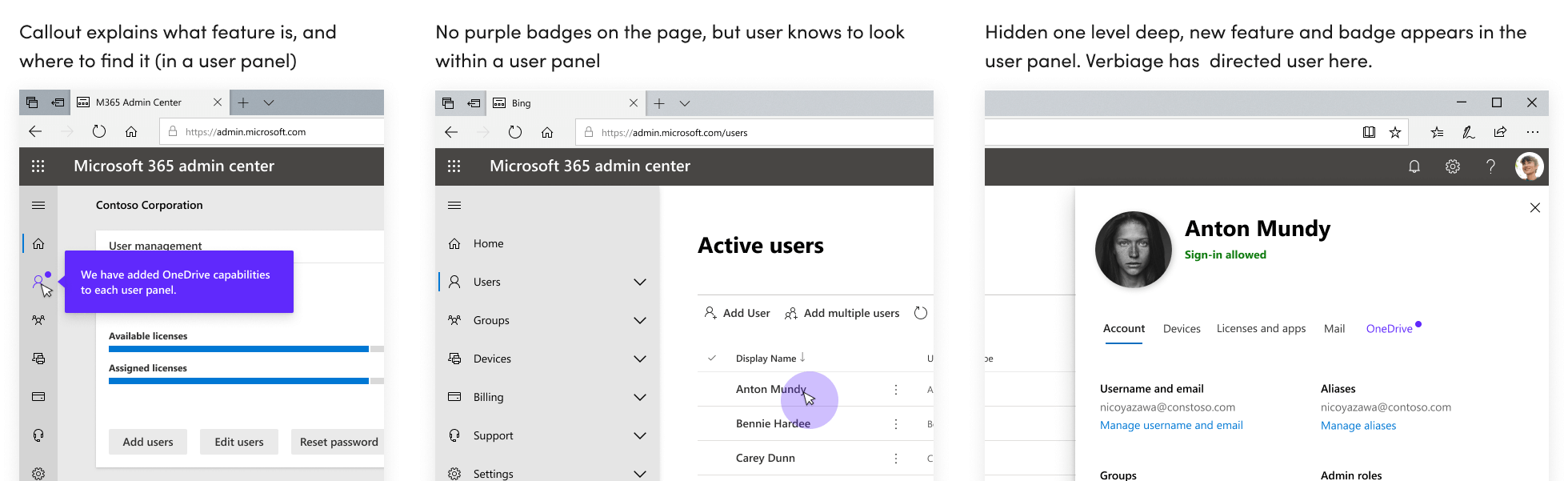
New things in a panel
When new features are released in the side panel, they're tagged “New” so that the user is aware.
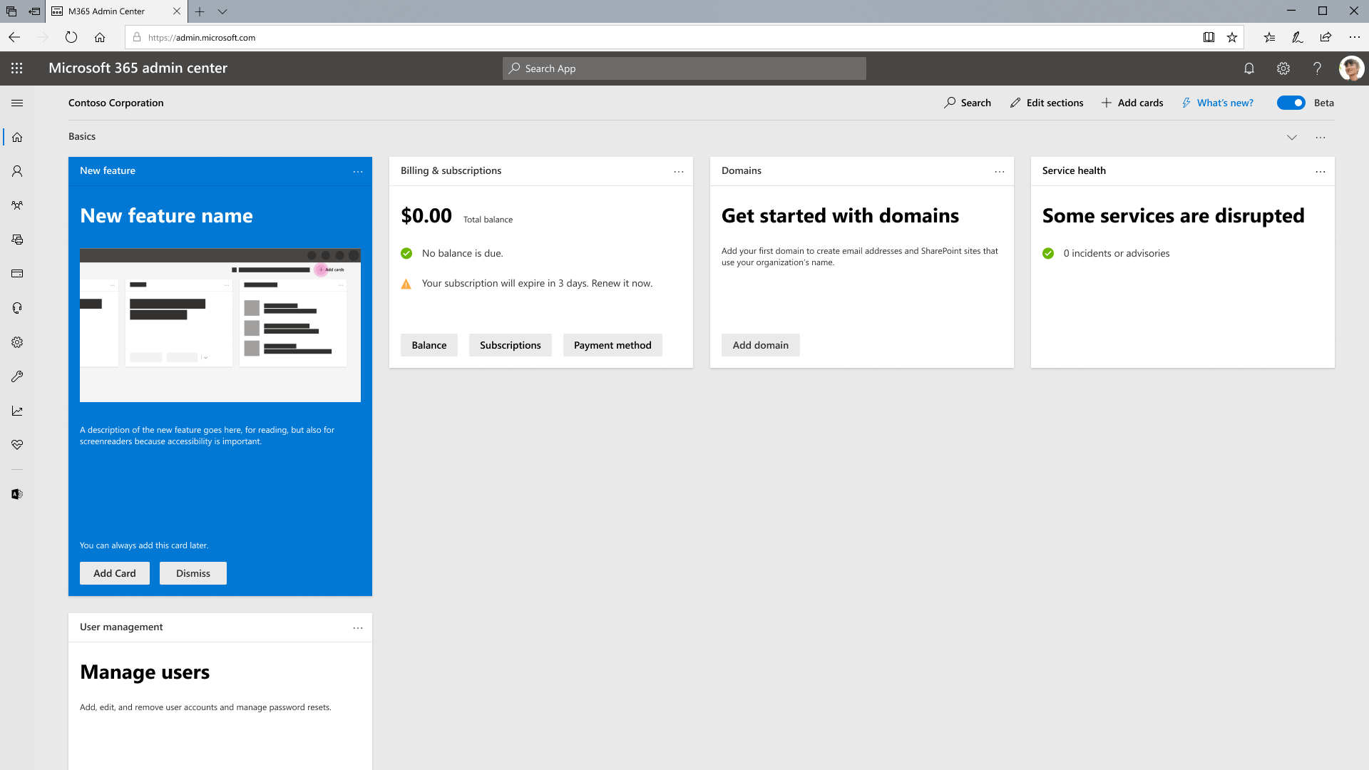
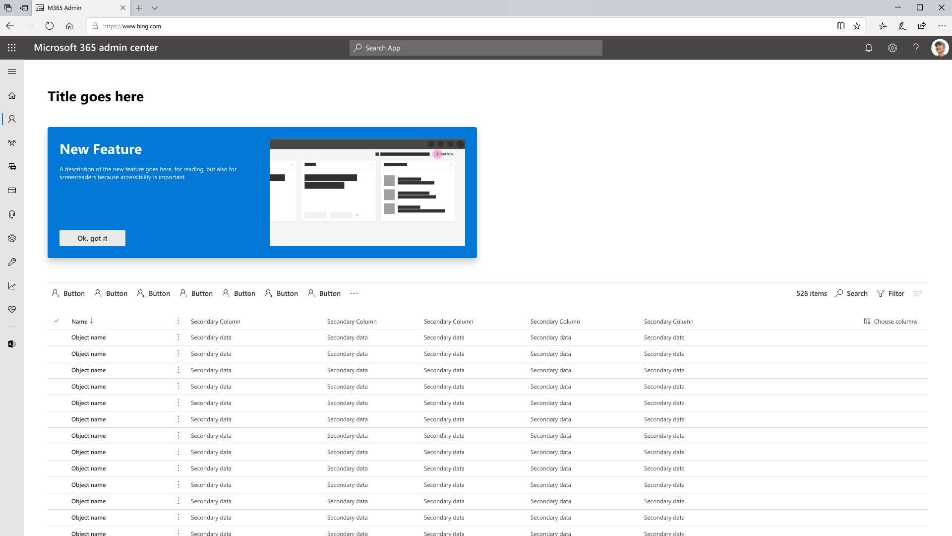
New things on a page
In pages other than the main dashboard, new features are highlighted in a big card so that users can learn about it.
Choosing to go the contextual route
My explorations only provided insight for that particular screen. There was no way to work it into a system. By going the contextual route, we can alert users without disrupting their workflow, and also come up with a system of alerting that's recognizable by colour, motion, iconography, and copy.
Below are a few of the motion studies I made to user test.
Creating a system
From our user testing insights, we inferred that just a badge is not enough. Combining a badge and an attention grabber (like the sweep) can help draw attention, and reinforce a system.
Other details we considered
Designs always work and look good in a vacuum, so it was important to go through the exercise of considering some edge cases.
What happens with multiple feature releases?
I put a bunch of dot badges on the dashboard, to show that it won't overwhelm a user. As a precaution, we also set a time of 45 days before the dots disappear if the user doesn't dismiss them. This time period was decided based on the longest time between logins, which was 6 weeks. Further tweaking, if needed, will be done based on future feedback.
Copy guides the user to where new features live
The sweeping motion and dot badge draws attention to the new feature, and the call-out does the educating. The copy written in the call-out doesn't only educate users on what the new feature is. In some cases, where a feature could be buried 2 or 3 levels deep in a page, the call-out is there to educate users on where it is.
Putting down a plan
Unlike most intern projects at big tech companies, I was told that this would actually be implemented. I worked with the broader design system team to work out implementation details.
Other stuff I worked on
Because I am a super sweaty tryhard in almost all aspects of my life, I took it upon myself to find as many small projects as I could during my short 12 week internship.
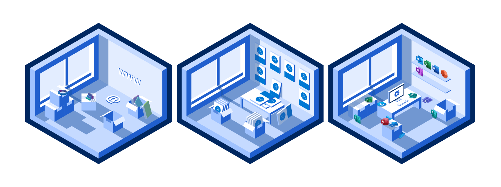
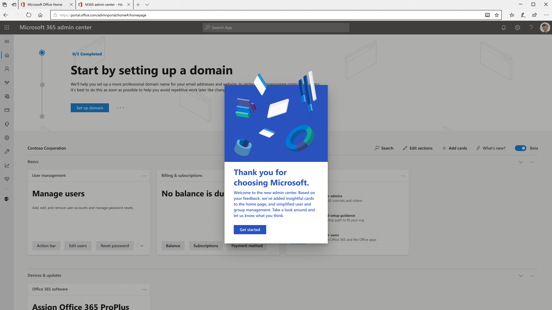
M365 Banner Illustrations
I created some different illustrations for the first-run experience banner on Admin Dashboard. I played with the idea of comparing setting up Admin Center to setting up an actual office, and was able to start a conversation around how we could use illustrations to better tell a story.
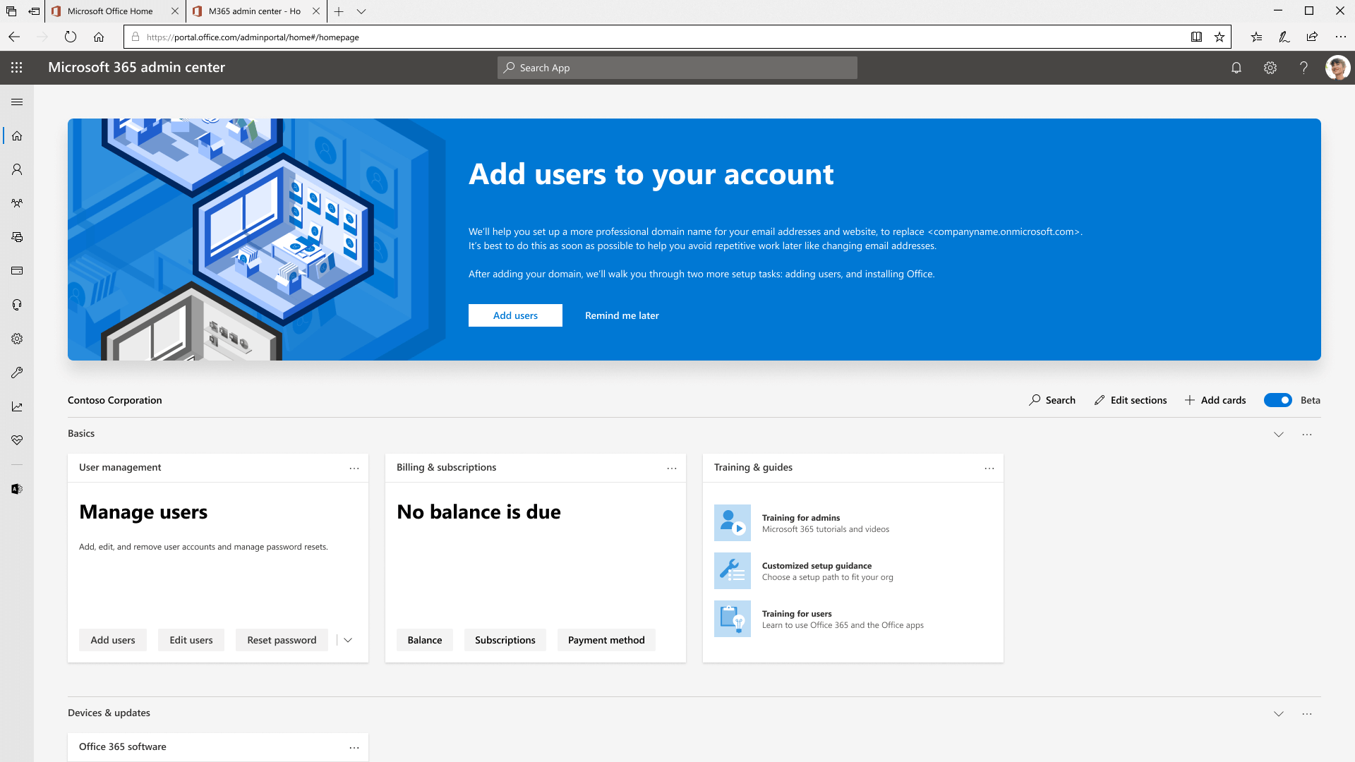
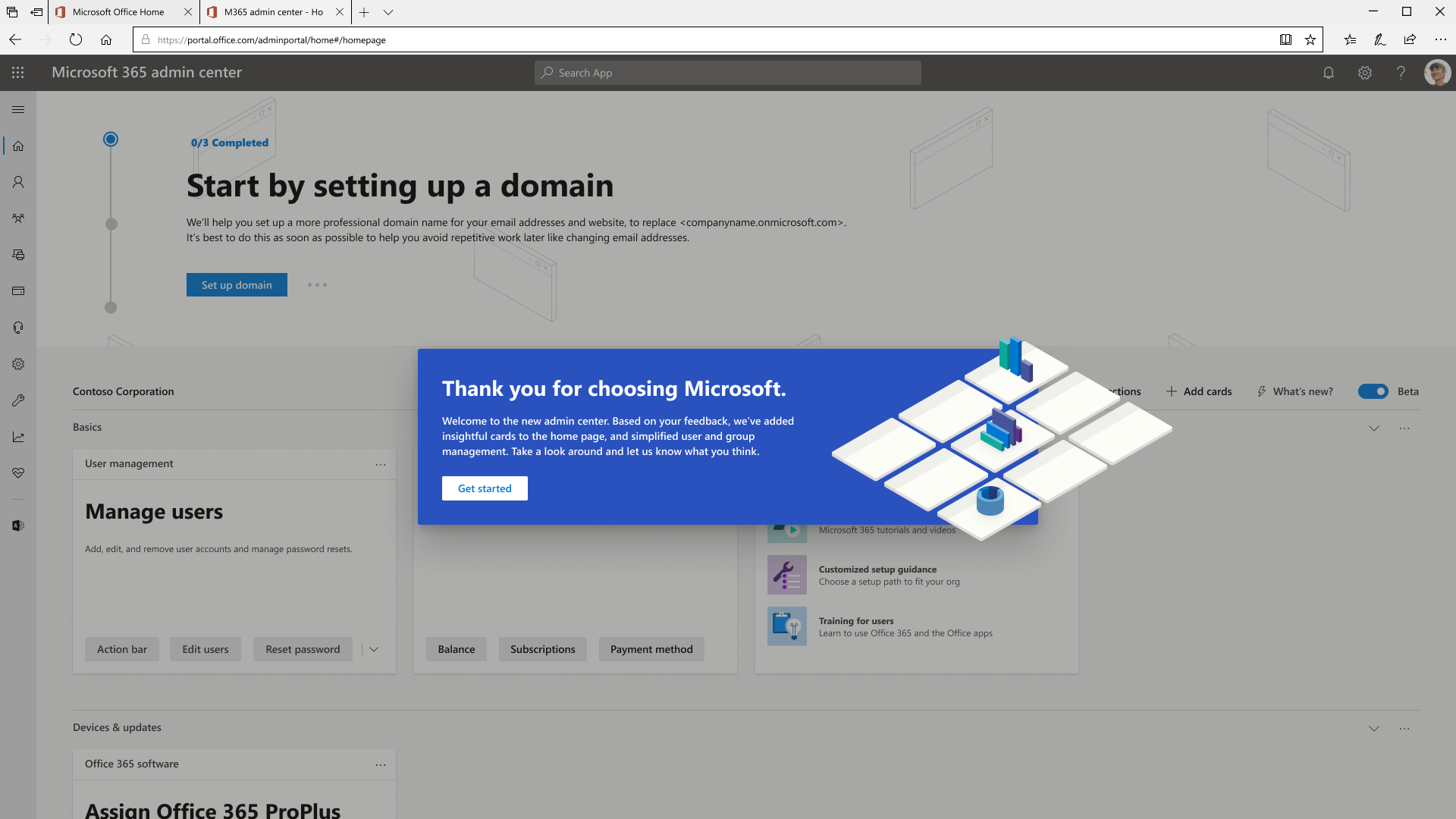
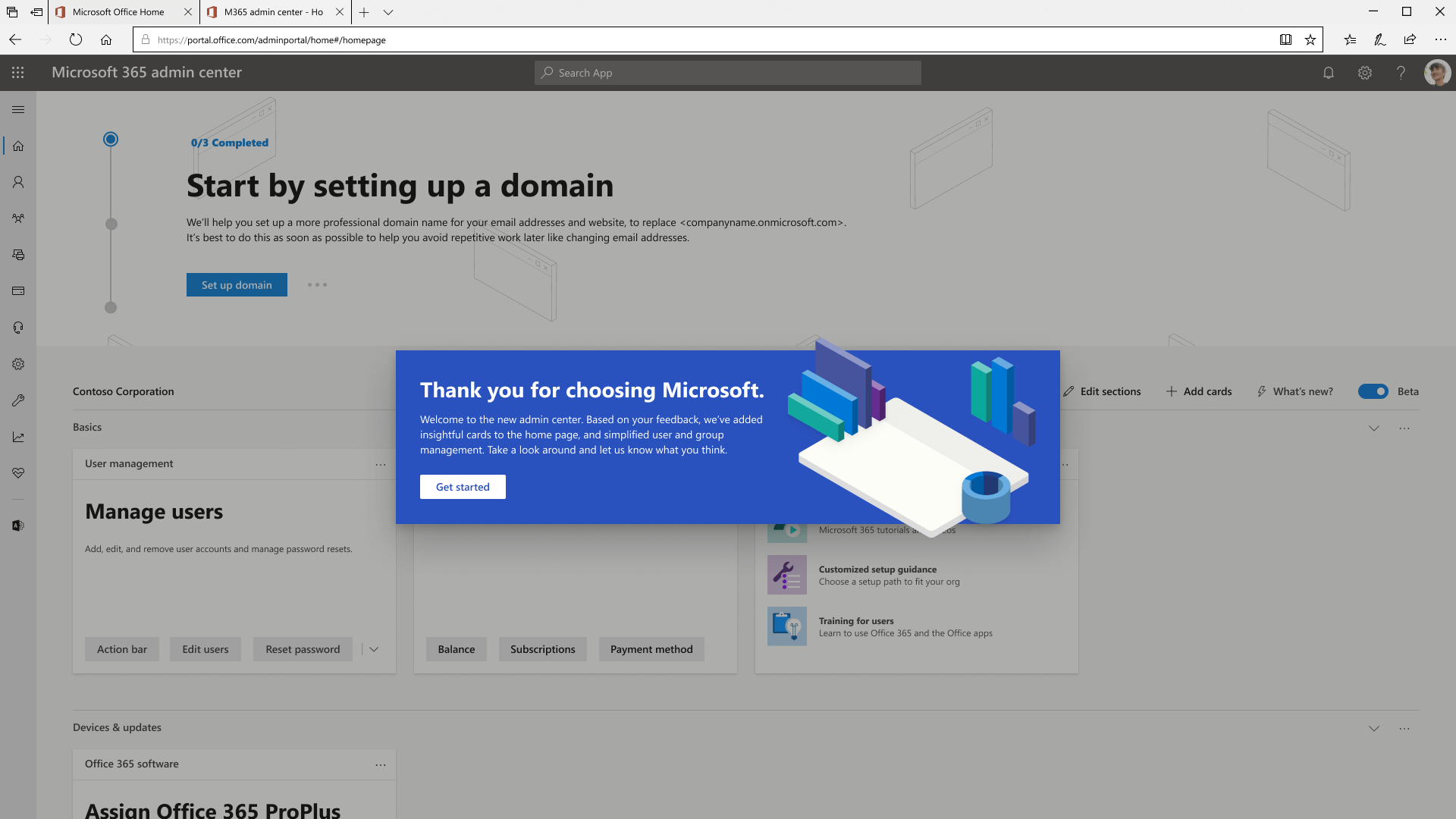
Welcome Banner
Our welcome banner was in need of a refresh, and I flexed my creative muscles to come up with over 30 variations, and landed on three of my favourites. I tried to push the boundary in terms of how we could use different illustrations, sizes, and orientations to better onboard new users.
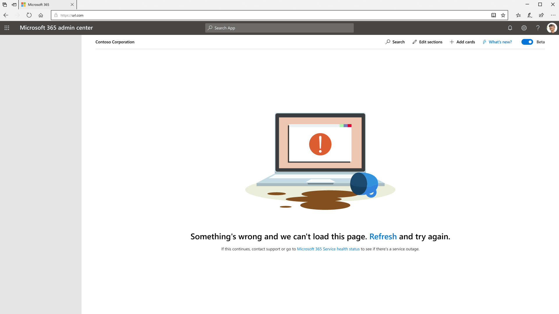
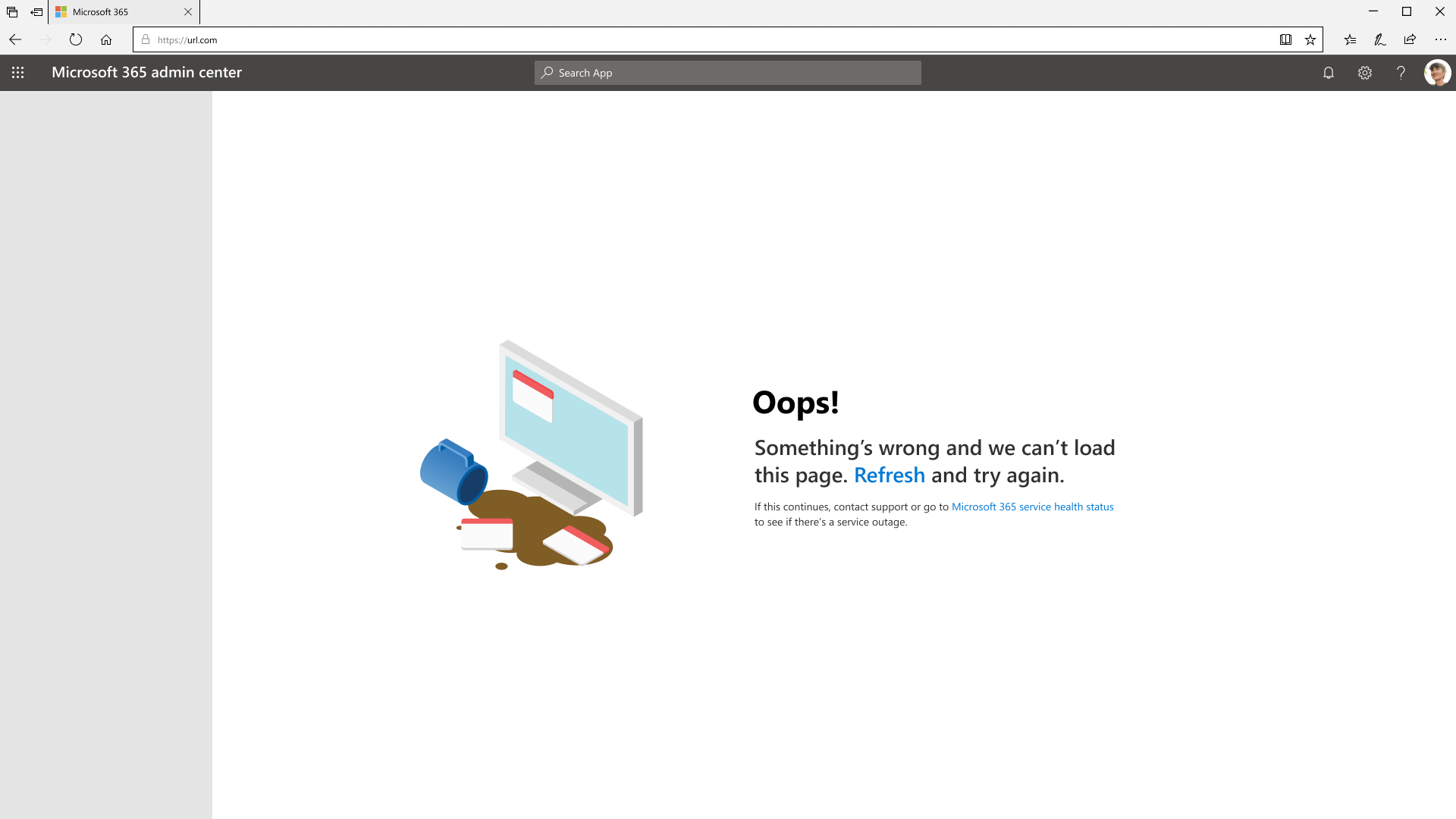
Catastrophic Error State
I worked with another intern to breathe life into an error page. I learned that for even the smallest features, multiple check-offs happen to ensure design consistency. I shifted my illustration to an isometric view, because my original work didn't comply with the newly developed M365 illustration styles.
Dark mode
While the push for dark mode was already happening, the transition was just a simple page refresh. I had some fun making a few different explorations to offer a source of inspiration for future designers, developers, and PMs on the dark mode project.
What I took away besides my memories
I'm reflecting on this a further two years later, and what I've learned then is probably more relevant to me than ever before.
Do first, ask forgiveness later
Existing designs, style guidelines, rules... these are all merely constructs. Nothing is ever set in stone, so it's always more beneficial for everyone if you put out work without worrying about constraints. This was forgiveable as an intern because internship work really doesn't matter, but now, as an experienced designer, I should also keep this mentality going into any future opportunities.